
We’re finally in a new decade, where hopefully things get better – oh, what’s that? Hm, things are already that bad a week in, huh? Well, let’s think about a different decade with CROSSNIQ+.

CROSSNIQ+ is aesthetically a love letter to an early 2000s aesthetic – or, more accurately, what pre-2000s people would think the 2000s would be like. There’s a futuristic look to everything, but that look is heavily stylized to look sleek and cool compared to the minimalism that society’s sensibilities had instead drifted to. Glossy metals, translucent cases, striking graphical design and curvy looks regardless of practicality dominated this aesthetic and it’s honestly an aesthetic that’s rad as hell. I really recommend checking this blog, the Y2K Aesthetic Institute, if you’re into this kinda stuff.
A bunch of games in the late 90’s and early 00’s embodied this style, even if only in just the game’s menus. In my personal experience, Super Smash Bros Melee leaned into this with its menu UI and how Battlefield and Final Destination were designed in that game. More particularly, the Dreamcast heavily leaned into the Y2K aesthetic. That original Sonic Adventure boxart of Sonic curving himself into a sick pose with that glossy background? Mwah, perfection.
This time period was also more rife with experimental, small-scope games. The Dreamcast’s Space Channel 5 and Chuchu Rocket – two games that also embody the Y2K aesthetic in different ways – fit into this role. CROSSNIQ+ follows in their footsteps, with stylish futuristic visuals and a solid commitment to a simple puzzle game experience.
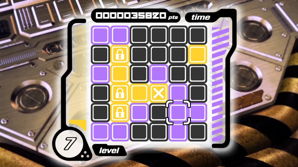
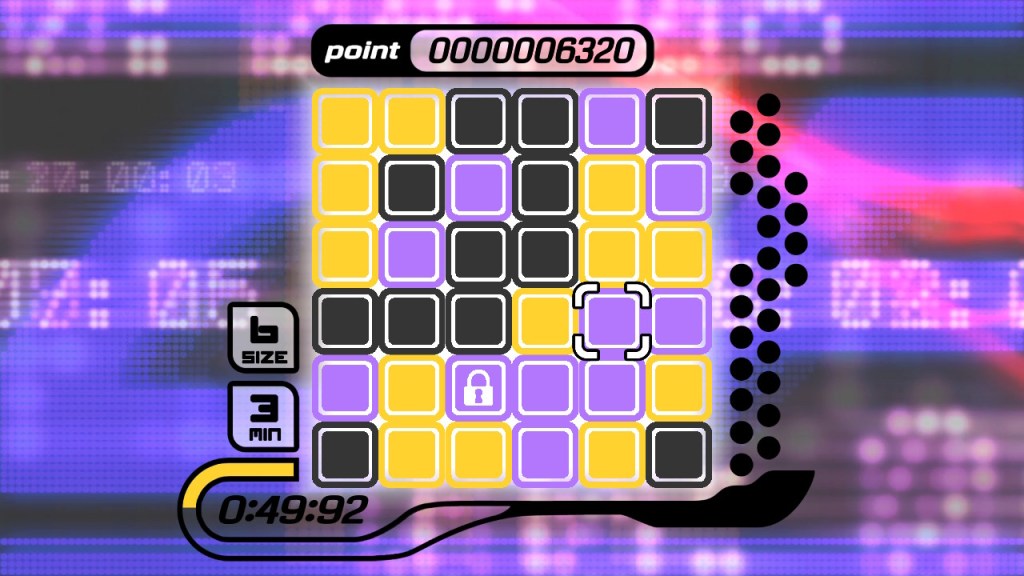
You are presented with a puzzle grid of tiles of different colors on top of a busy background that feels like it belongs in an early music video. The main goal is to create crosses of the same color on the playing field. Unlike a lot of puzzles games, the game is less dependent on creating combos and instead focuses more on speed. This is especially evident in Endless mode, where you’re constantly racing against an increasingly short timer that resets every time you create a cross.
To create crosses, you scroll a row or column across the screen to align tiles. The tiles also wrap around the screen, so you should always keep scrolling in the other way in mind if there’s something preventing you from scrolling forward. What’s exactly stopping you? There are occasionally tiles with locks on them that prevents you from screen wrapping when they hit the edge of the playing field. There are also tiles with “X”s on them that are way more dangerous in that you can’t move a row or column that has one on it. It’s mildly annoying, but it quickly becomes debilitating if there’s multiples on the screen. You can however break these bad tiles by creating a cross with them or creating a cross right next to them.
This gameplay is really the ideal that you want to see in an arcade puzzle game. It’s easy to grasp while having a healthy amount of challenge, creating an addictive experience that will keep you coming. Personally, the Nintendo Switch version (which I played) may be the ideal version because it offers the alternate control scheme of touch controls, which to some, may be faster than playing it with standard controls.
And the music really helps make the experience. CROSSNIQ+‘s soundtrack is made up of electronic music – mainly jungle and drum and bass – that brings a lot of energy to the gameplay. Personally, my favorite out of the soundtrack is OPTIMISTIQ. I know that I’m bad at talking about music, but it’s got this vibe of walking around a busy futuristic shopping center, an experience that practitioners of the late 90’s aesthetic probably dreamed of. If there’s one complaint about the music I have, it’s that I wish that there was an option to pick a random track so that the music could switch up when you opt to retry because man, this is a game you’ll probably be doing a lot of retries in.
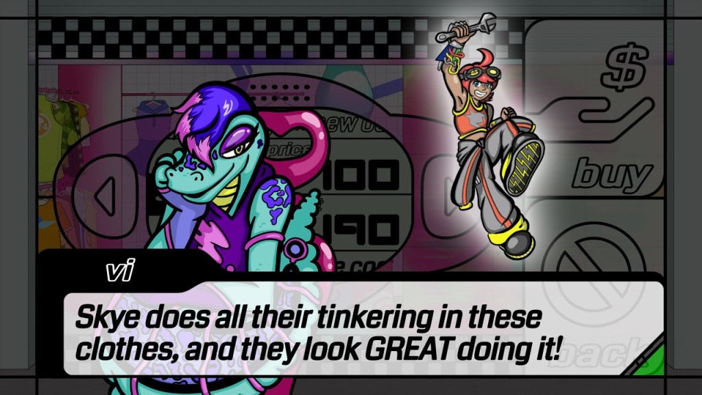
But anyway, speaking of shopping centers, you get awarded with coins after play sessions which you can spend at the shop and donate to the museum, where you’ll meet the only characters you see outside of the tutorial and multiplayer mode. Going back to the Dreamcast inspirations, the character designs feel really reminiscent of the Dreamcast-era Sonic games and Jet Set Radio.
Most of the stuff purchasable in the shop are for the game’s multiplayer, which is local only. If you’ve got a friend, you can go head-to-head in a competitive mode where successfully creating crosses reduces the timer on your opponent while increasing your own, with quicker cross creations putting locked tiles on your opponent’s board.
The multiplayer mode is also where you get a glimpse at characters beyond the shopkeepers, with each pairing having different after-match dialogue. Each character also has their own kinda super, but I forget how I even activated them because my sister insisted on skipping the tutorial. Probably by making a whole bunch of matches, I dunno. I kinda wish that you got some of this character stuff outside of a multiplayer mode, though I understand that an indie developer can’t just make perfect puzzle-playing AI. And again, can’t expect them to make a perfect online multiplayer mode out of the gate. I will note that an advantage of getting this game on Steam instead of Switch is that you can do that remote co-op thing they’ve recently introduced, so there’s that to consider.
Also, this is kind of a small thing but. The default character being a brown-skinned somewhat masc person going by they/them is a gift. That’s actually me. Thank you.
While it may be a hardcore arcade puzzle game, that doesn’t mean there’s no room for accessibility. In Cal’s museum, you can engage in a relaxed game mode where you can just make crosses without worrying about time or score. The fast-paced soundtrack is replaced by ambient noise and that and the designs of the tiles are based on whatever painting you pick, with new ones becoming available when you donate. Outside of that, you may look at the flashy backgrounds trying to invoke the game’s overall aesthetic and think it’s a strain on the eyes, if not actively harmful. Well, you can actually add a filter to make it less of an eyesore or make the backgrounds into static images. They’re simple additions, but they’re simple additions that make the experience welcoming to more players.
On the flipside, you can also make the game more harder, if you wish. You can extend the playing field to a bigger size, which also demands that you use more colors. Personally, I’m actually pretty satisfied with the default “size 6” grid. I don’t know, the bigger grids kinda feel more tedious to play with to me.
CROSSNIQ+ is just a damn good time embodying a really cool aesthetic. If you like arcade puzzle games or maybe just like the vibes this game radiates, I absolutely recommend picking it up.
| People that worked on the game: | |
| Max Krieger | Director, Designer, Developer, UI Artist, Writer |
| Alice Morrow | Illustration Director, Illustrator, Character Designer |
| Miles Shank | Illustrator, Character Designer, Fashion Designer, Visual Design Consultant, Writer |
| D.V. Caputo | Composer, CG Artist, Sound Designer |
| David McKee | Composer, Sound Designer |
| Taylor McCarron | Background Illustrator |
